Remarks
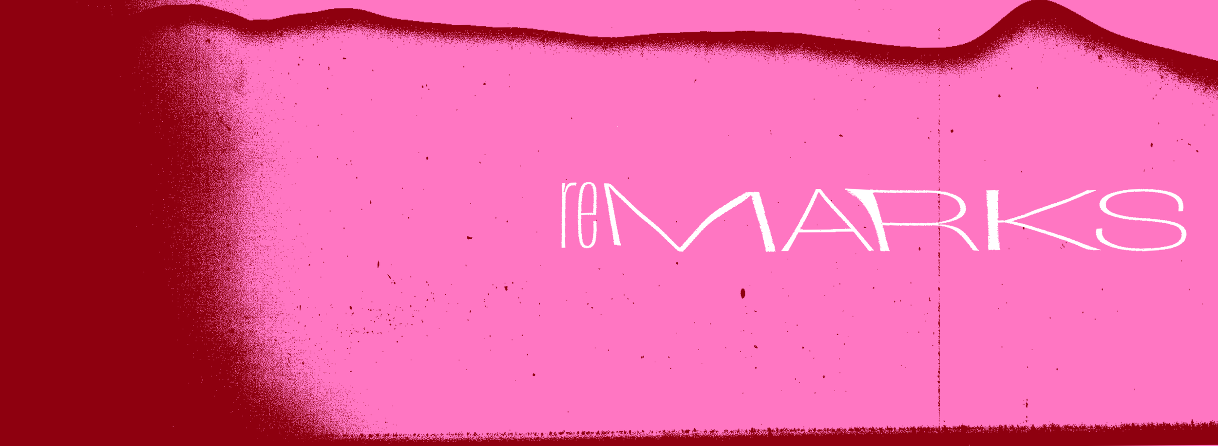
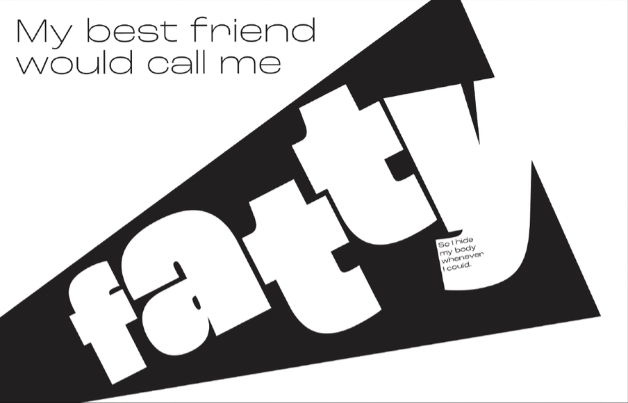
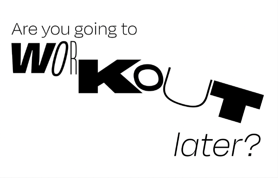
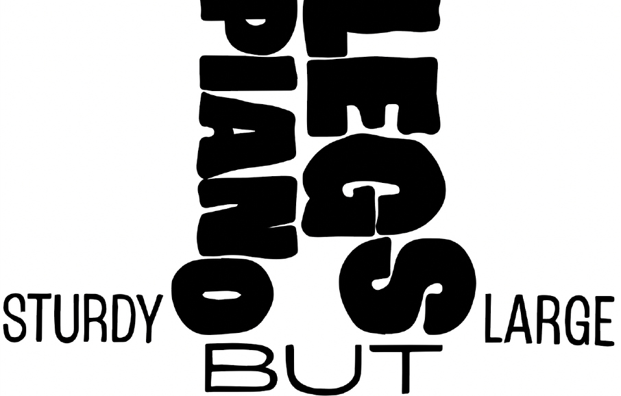
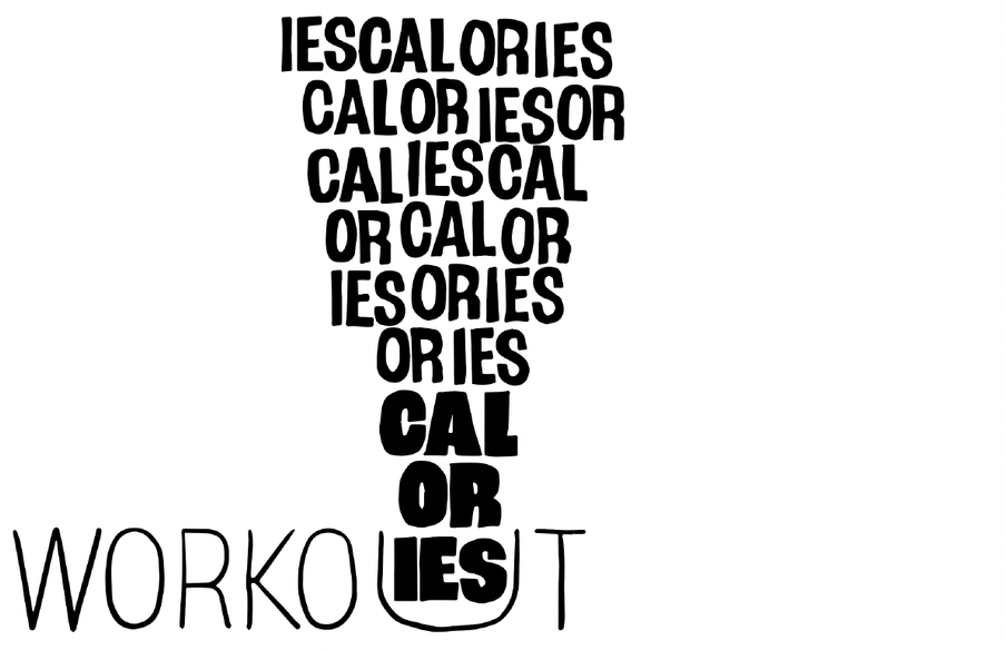
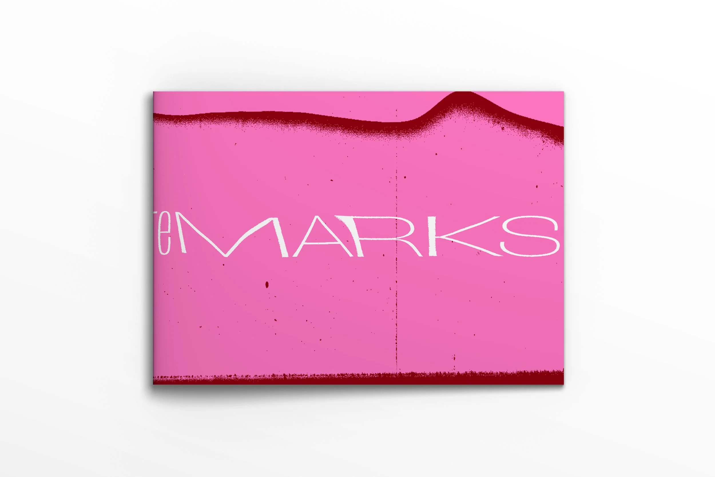
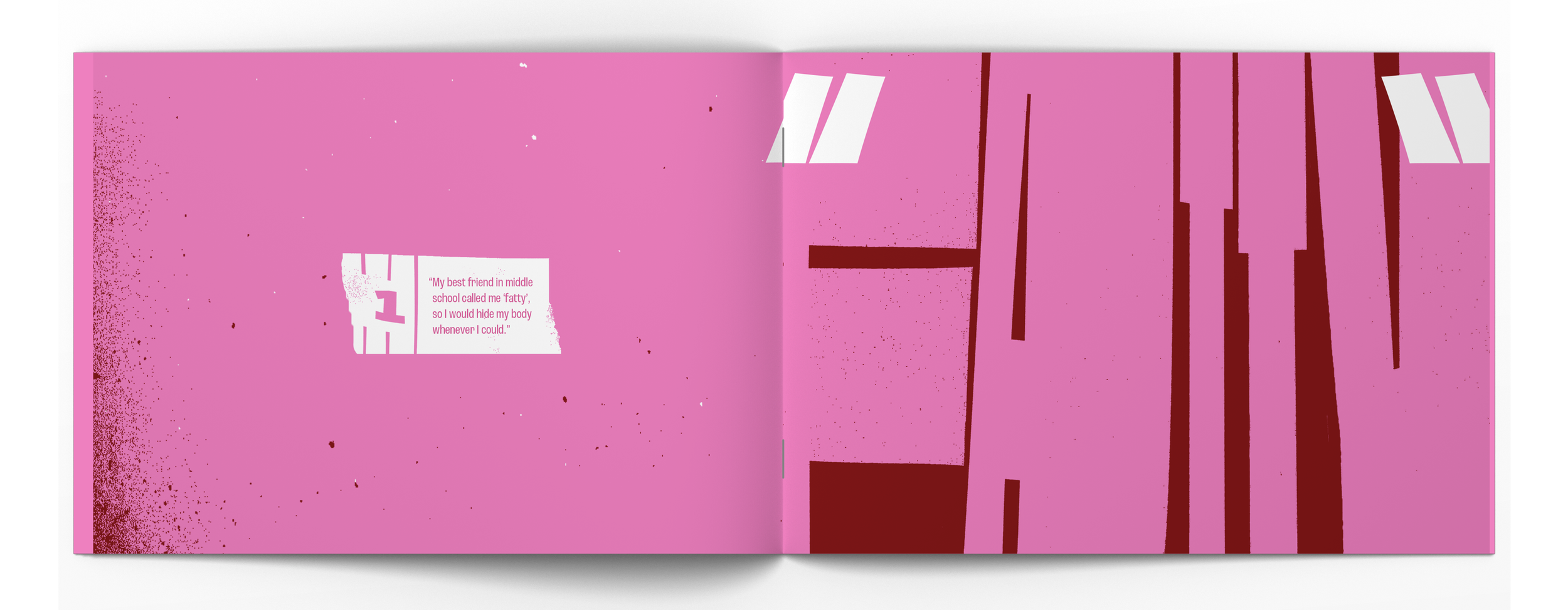
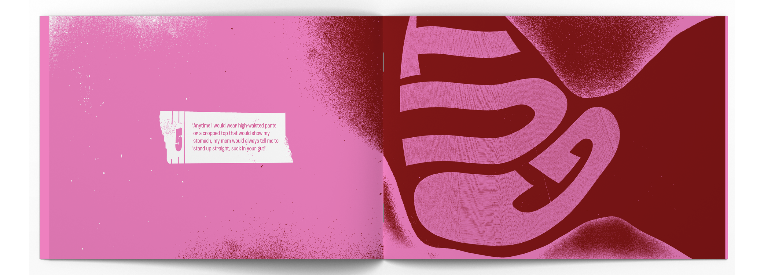
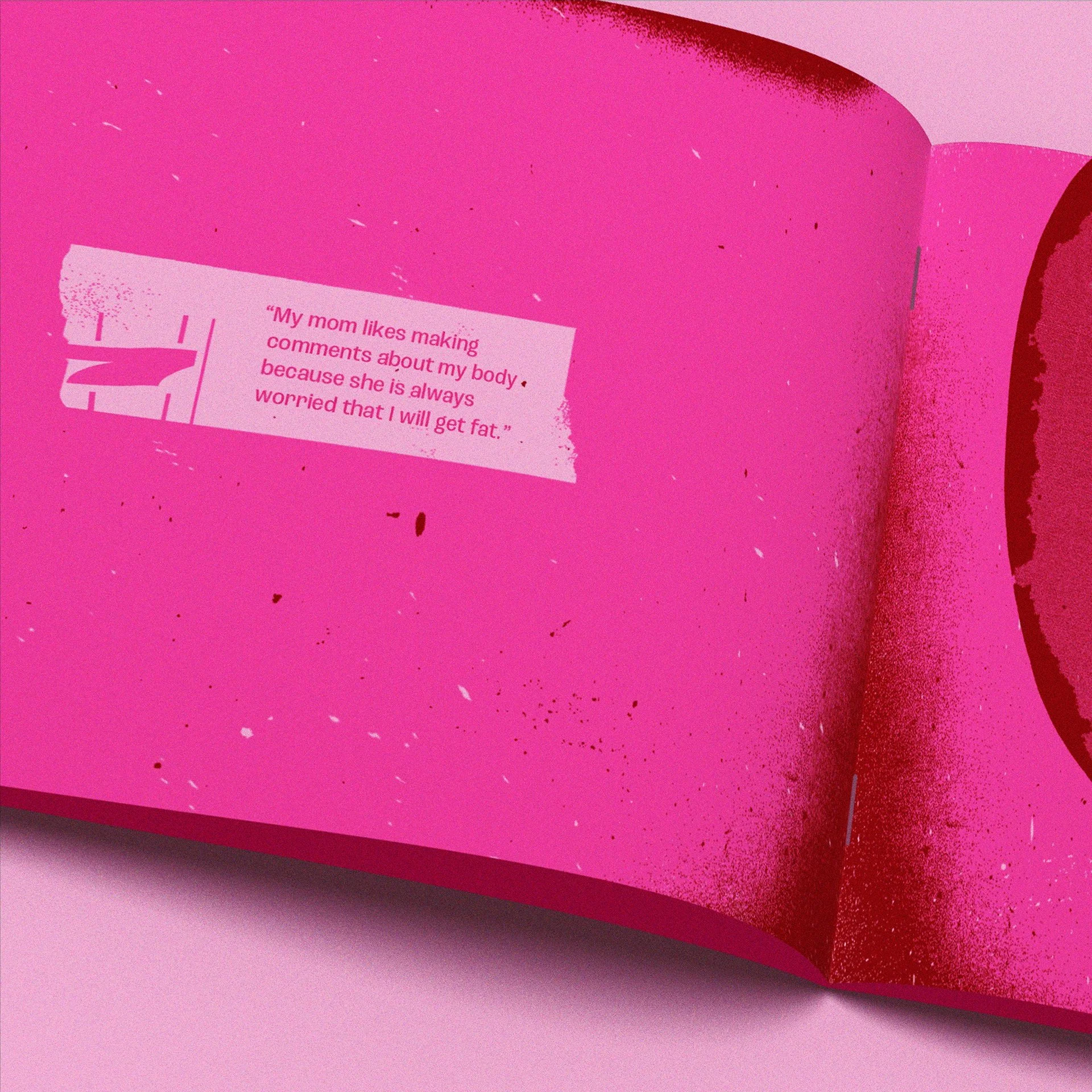
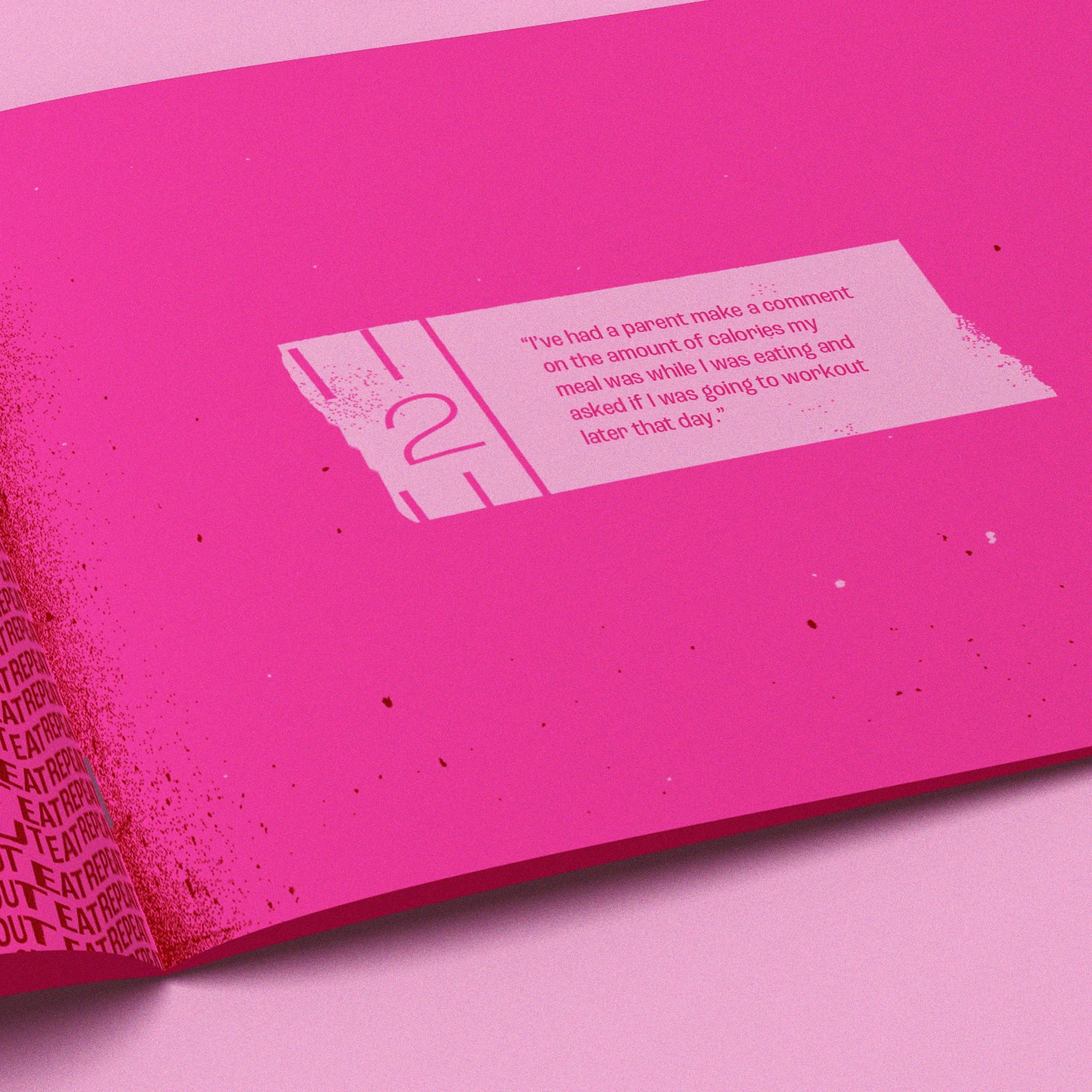
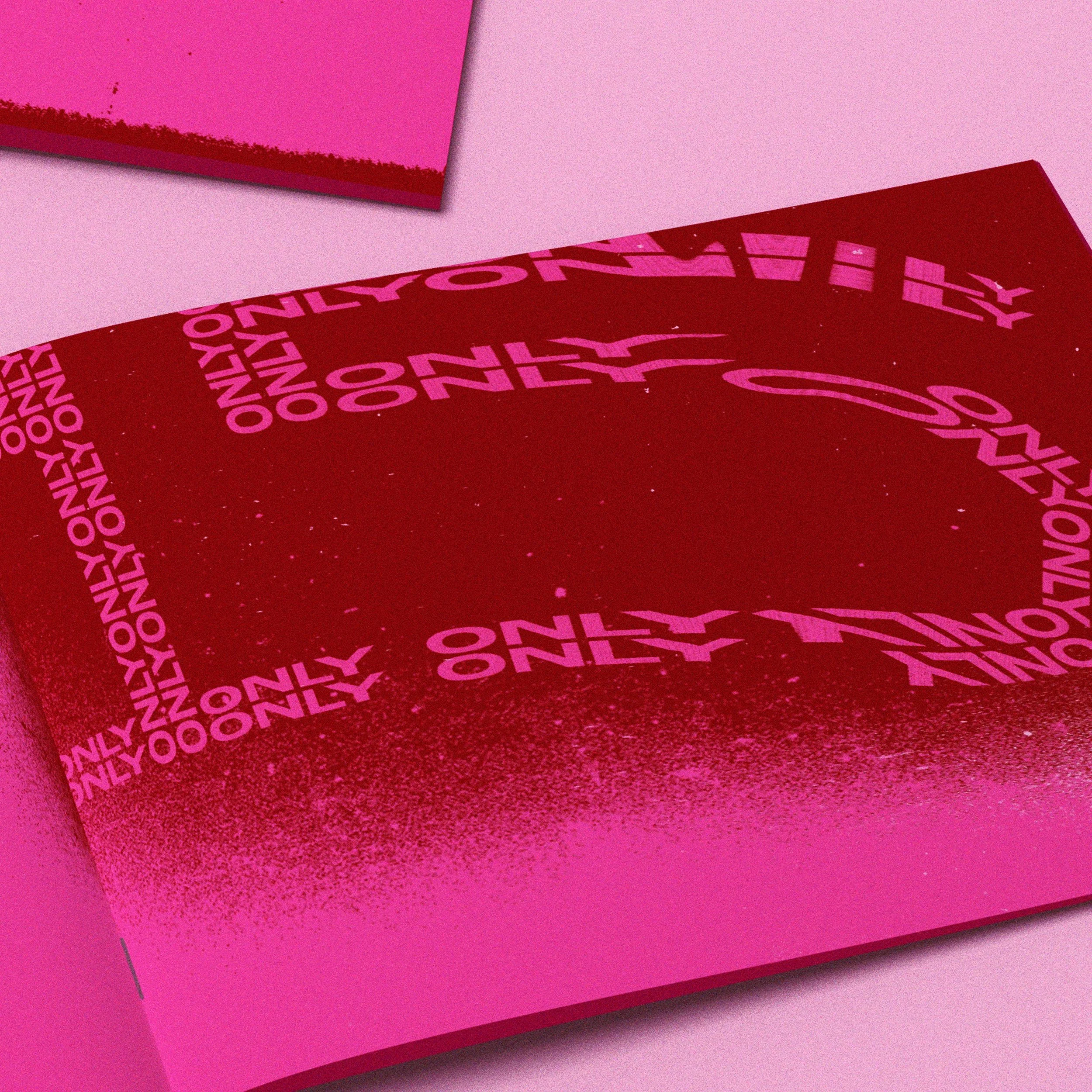
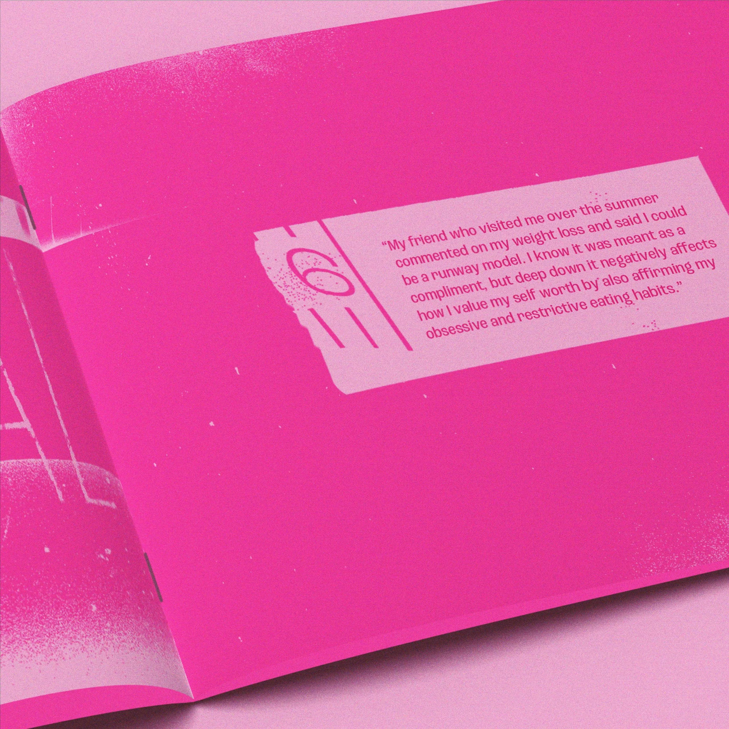
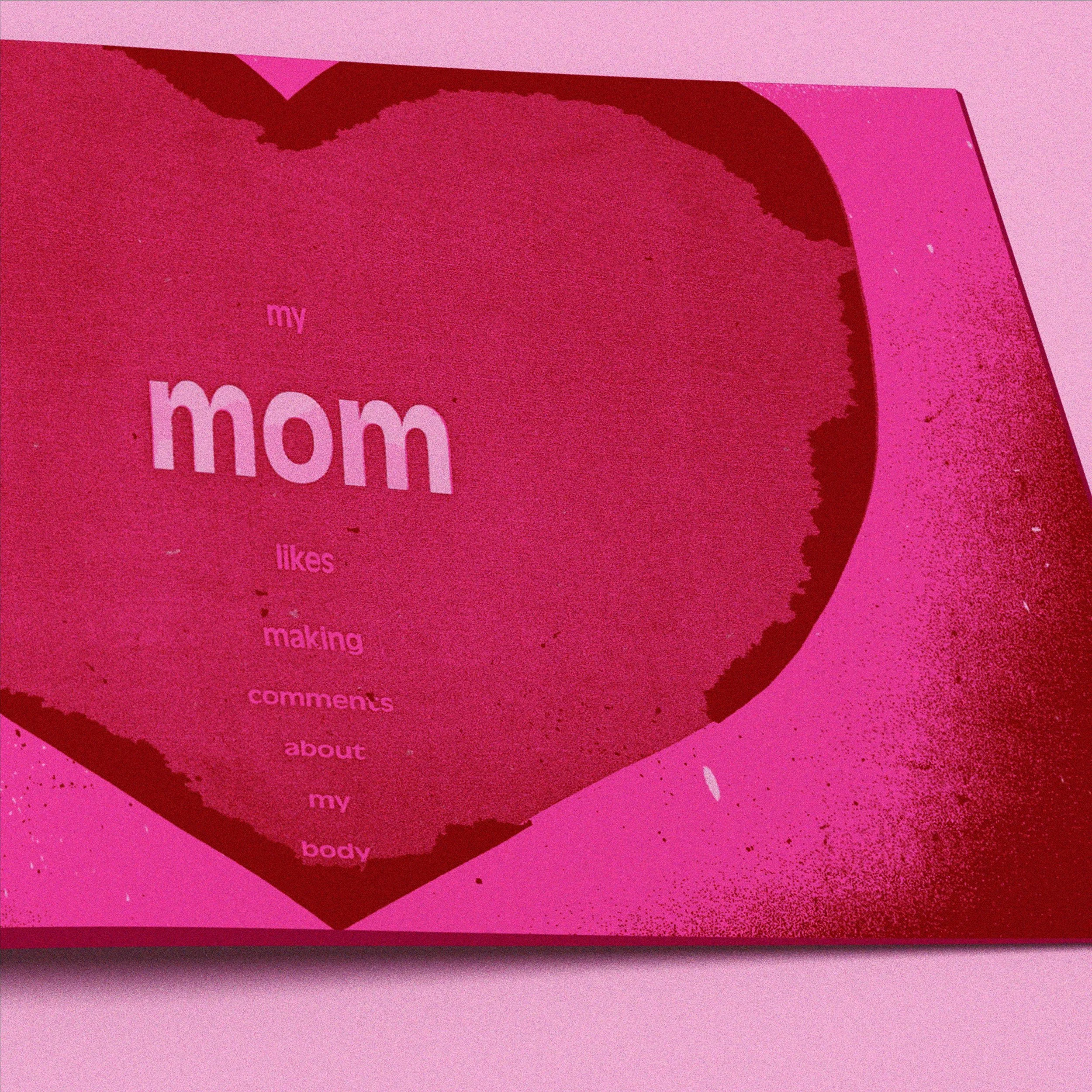
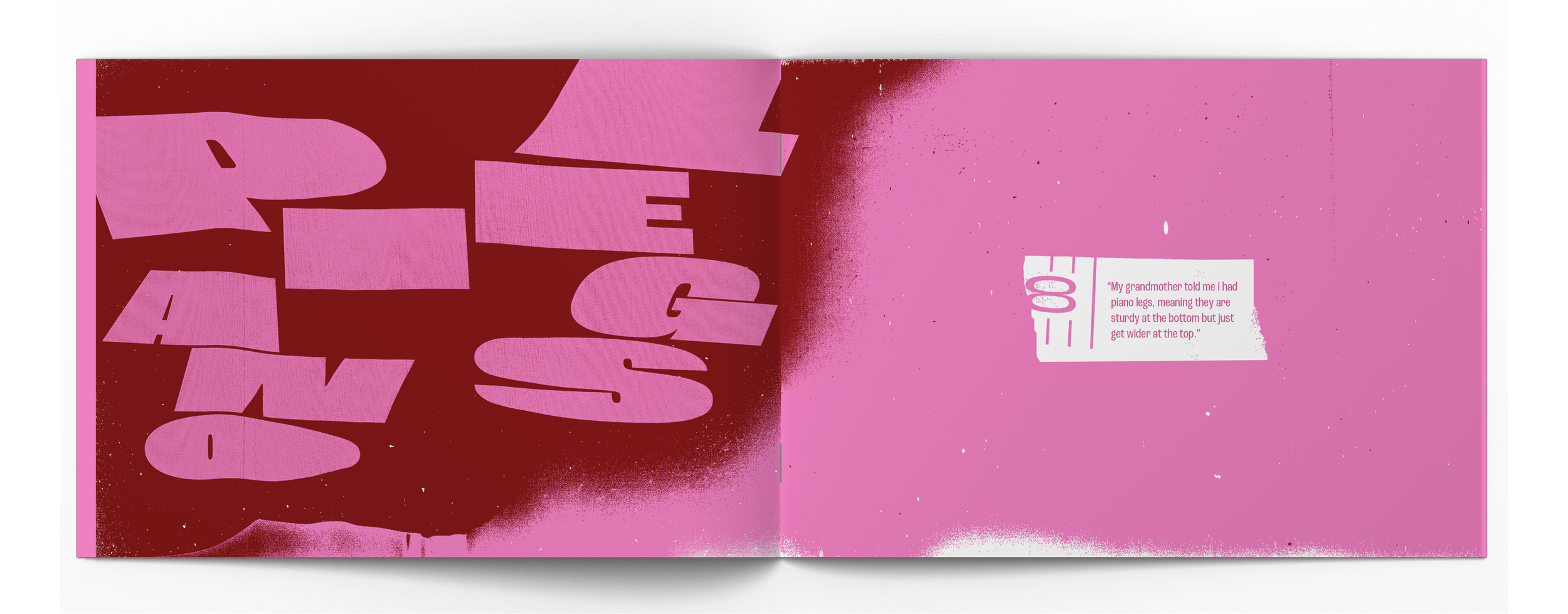
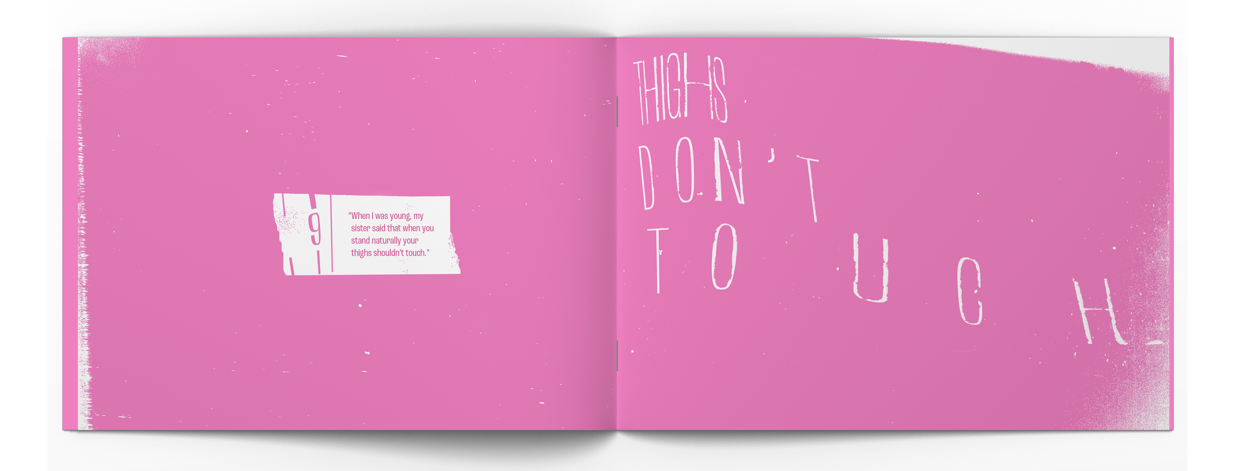
Remarks explores personal comments about physical appearance through expressive typography and distortion. This zine compiles anonymous survey responses from individuals reflecting on comments that altered their self-perception, all originating from loved ones. My own struggle with body image, influenced by childhood comments, drives this project. Rather than focusing on size, I aim to examine how comments shape our self-worth and mental well-being.
EXPLORING BODY IMAGE
A survey gathered around 30 anonymous responses, revealing insights into how individuals perceive their bodies versus how others see them. This helped me identify impactful comments about physical appearance.
EXPRESSIVE TYPOGRAPHY
Initially, I planned to use typography to present these quotes, guided by principles like bold contrast, extensive type families, and emphasis on certain words.
MANIPULATING TYPOGRAPHY
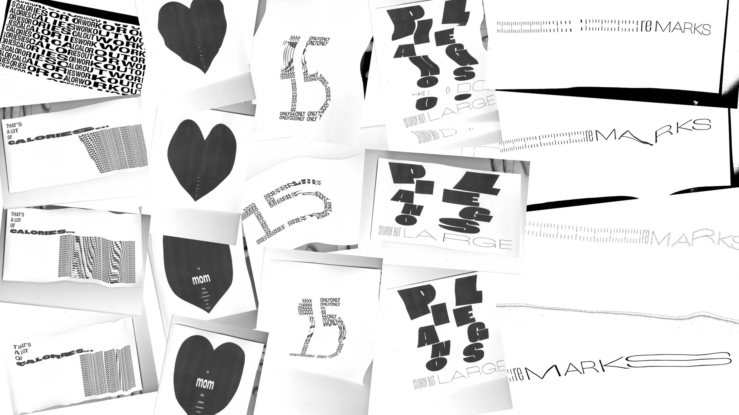
As I created these compositions, I felt they didn’t fully capture the impact of the comments. I began to experiment with visual elements like drawing over content, simplifying comments, and incorporating texture.
EXPERIMENTING WITH SCANNING
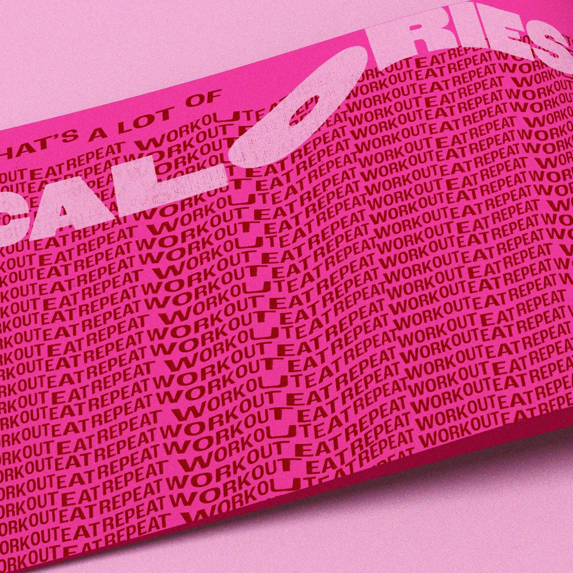
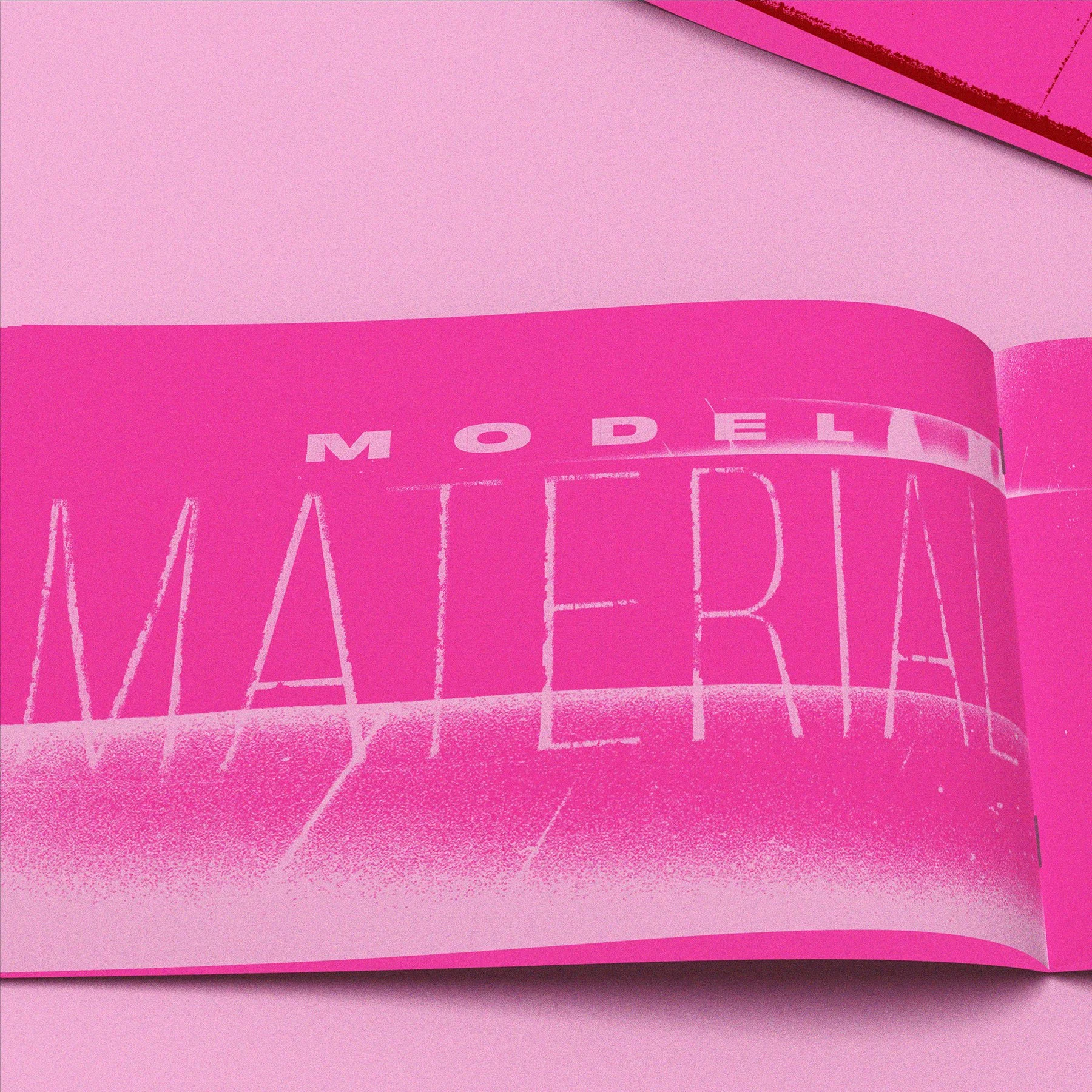
I shifted to using an Epson photo scanner to distort typography, which offered benefits like uncontrolled distortion, gritty texture, and high contrast.
MEANING BEHIND SCANNING & OTHER VISUAL ELEMENTS
The zine emphasizes how comments influence self-worth, connecting back to the theme of measurement. The scanner effectively conveys this through distortion, reflecting societal tools—like tape measures and social media pressures—that gauge our value. The contrasting red and pink colors evoke different moods, with red feeling uncomfortable and hot pink appearing artificial.
