Lantern aims to unite psychedelics with therapeutic practices to simplify the search for effective mental health remedies. The brand prioritizes accessibility and sustainability, promoting the safe and proper use of psychedelics through various microdosing methods. Recognizing the importance of breaks to prevent tolerance, Lantern emphasizes a mindful approach to medication.
Lantern Entheogenics
The name "Lantern" reflects the contrast between "lantern" and "spotlight" consciousness, highlighting the need to rekindle imagination and creativity as we age. To combat the stigma surrounding psychedelics, Lantern employs strong visual elements to shed new light on this medicine.

“Consciousness narrows as a function of age.
As we know more, we see less”.
From Alison Gopnik & Alvy Ray Smith
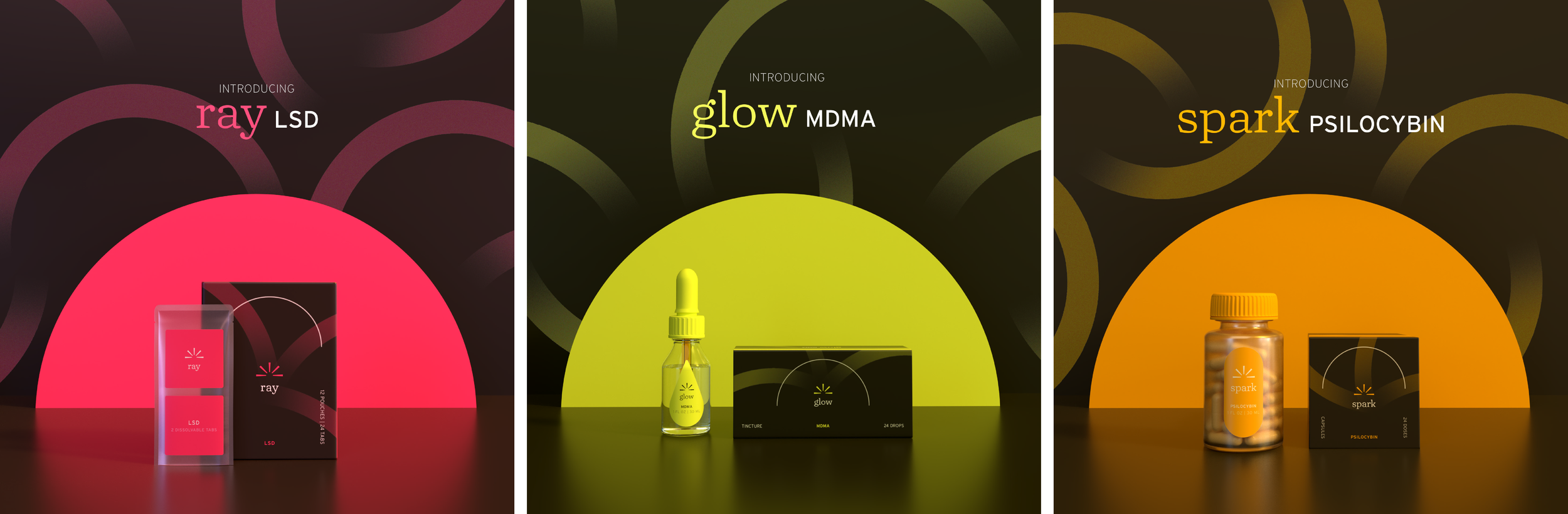
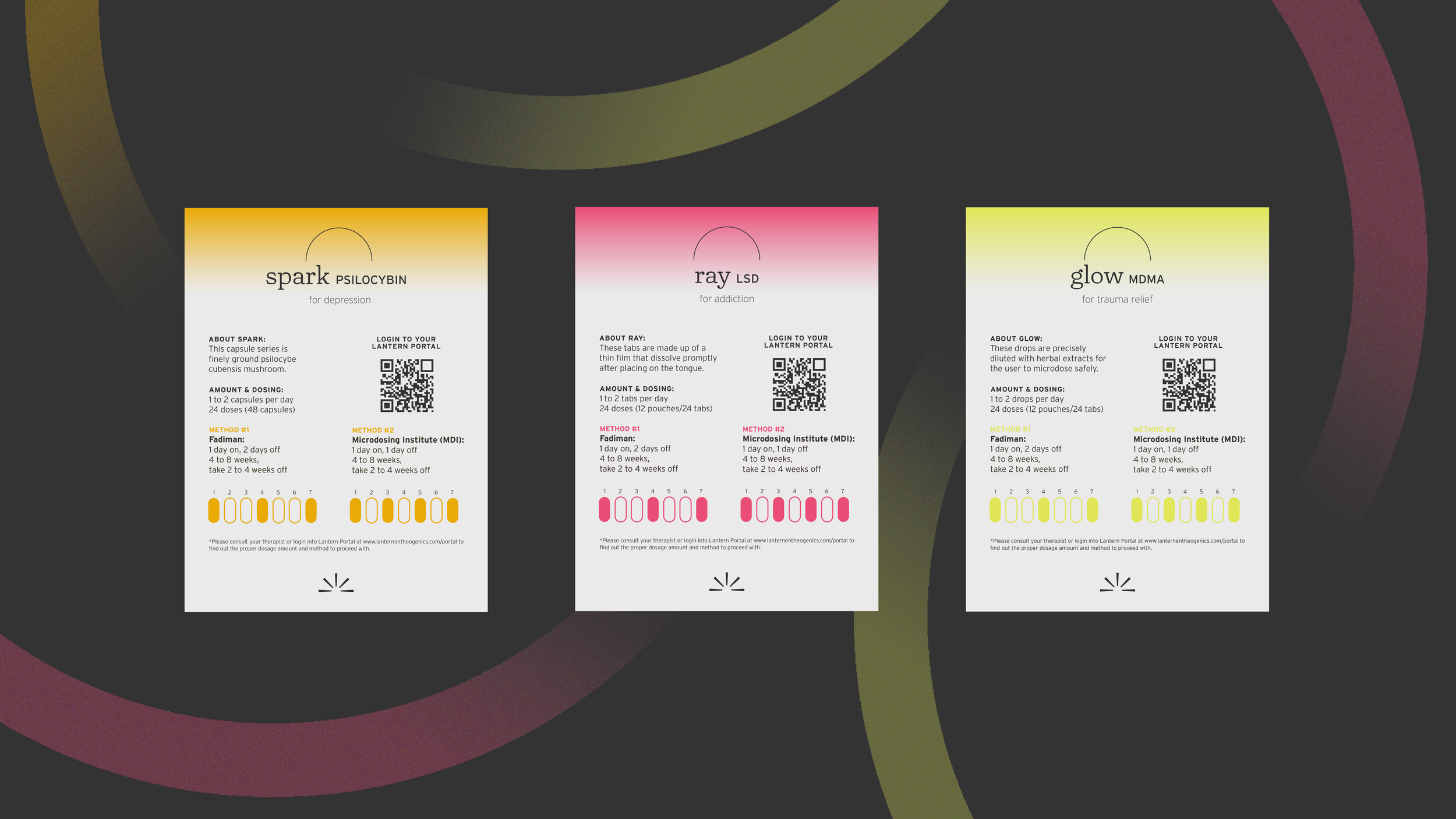
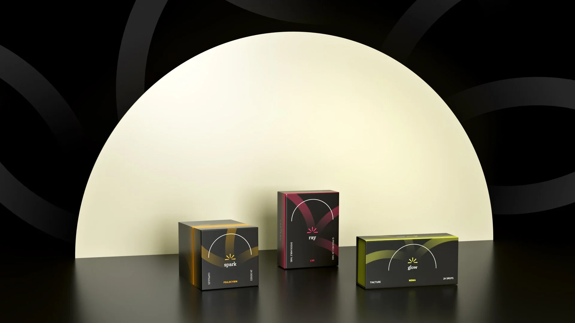
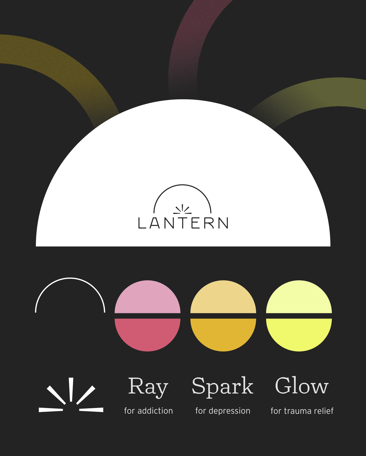
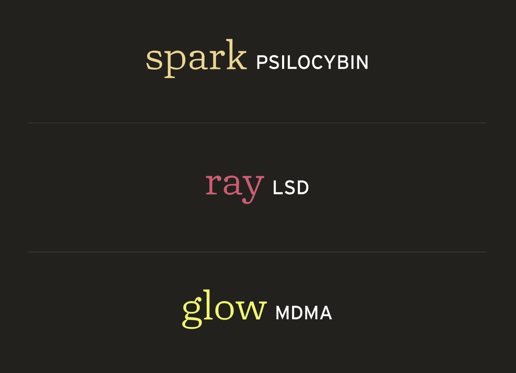
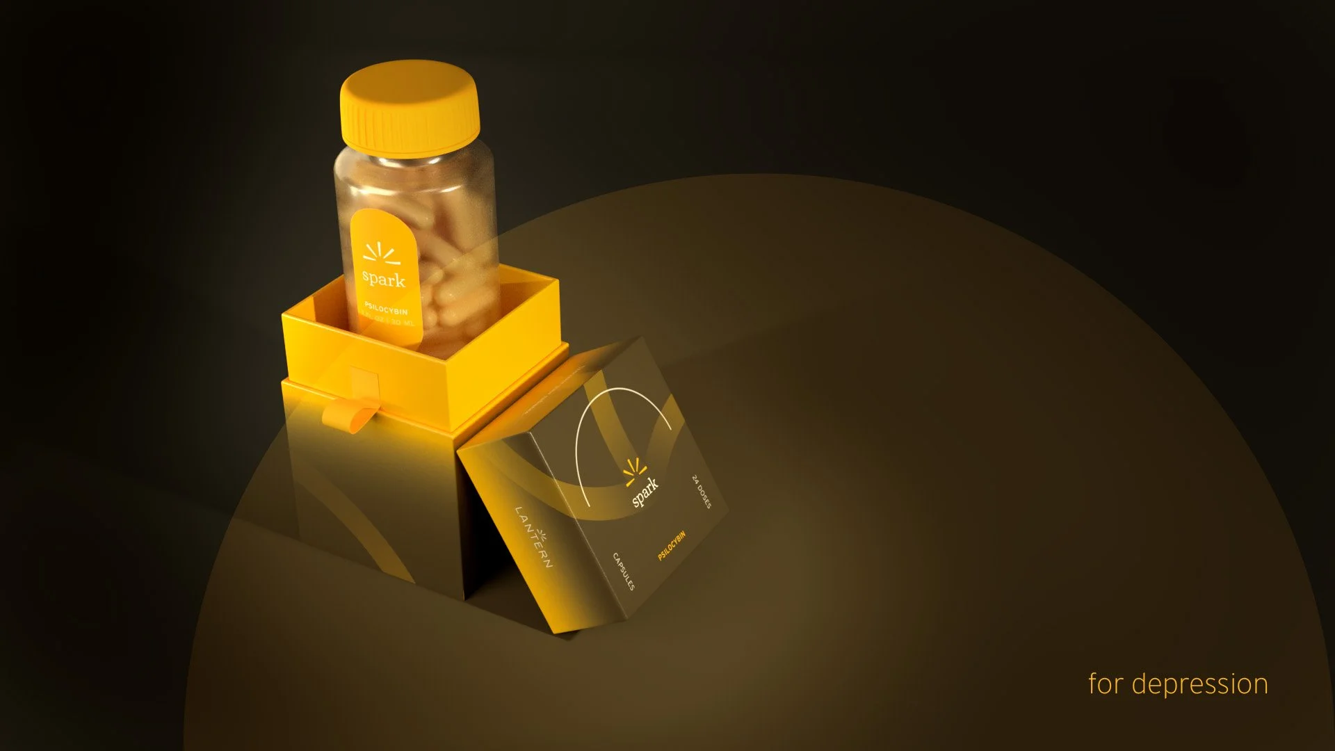
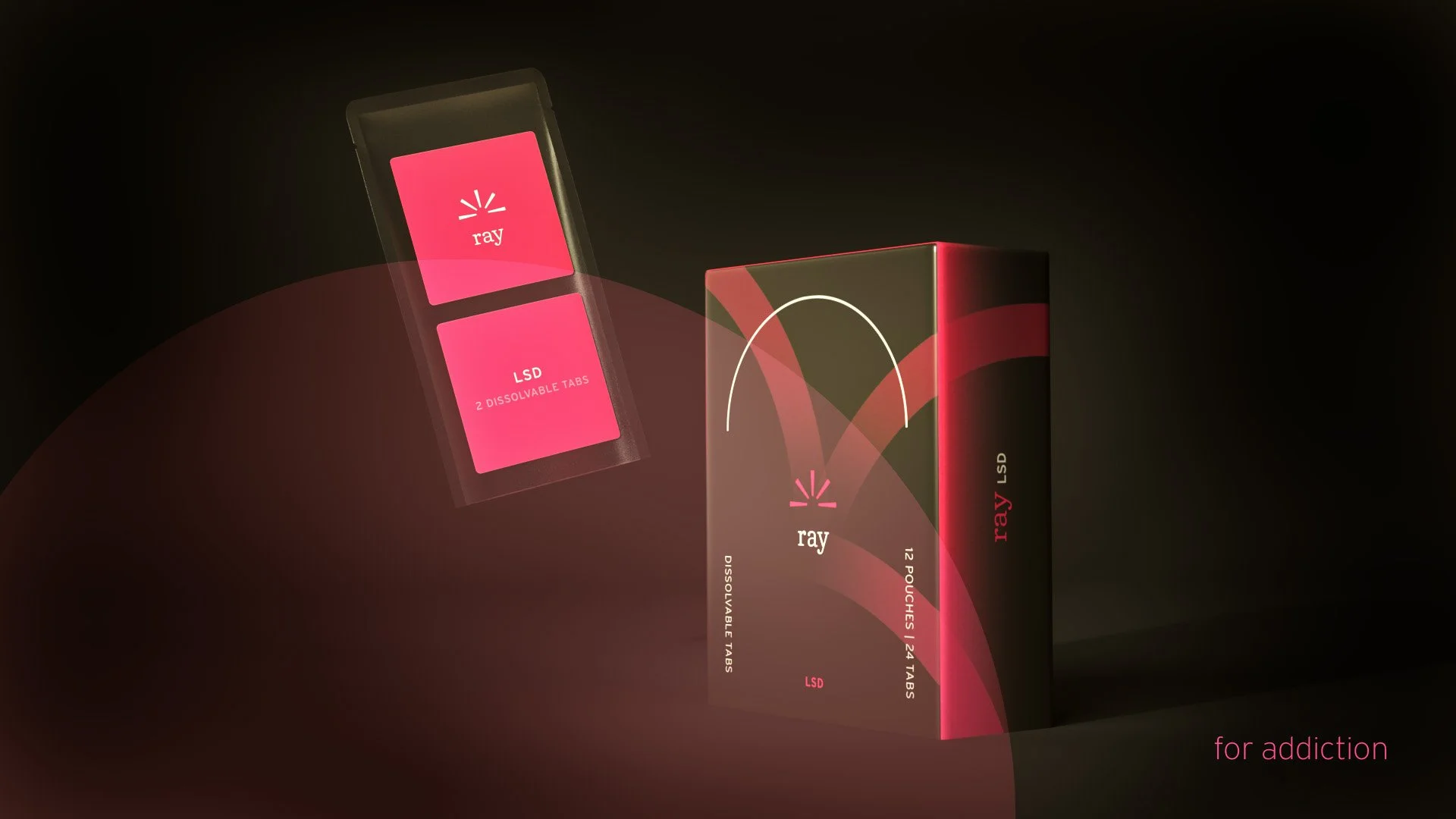
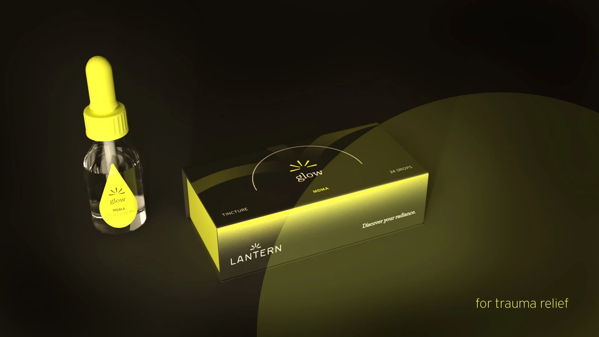
The logo features subtle sun rays symbolizing a brighter future for patients. A rich, warm color palette, along with vibrant lines and dome shapes, represents the brand's mission to restore radiance to life. Packaging balances tranquility and joy, with each box including an informational card and a QR code for accessing the Lantern portal.
The website provides research and testimonials, while the portal helps users track their dosing and offers self-guided meditations and monthly affirmations. Progress in affirmations is visually represented as phrases gradually reveal themselves. Environmental graphics reinforce the hopeful and calming ethos of Lantern's therapeutic centers.